Everyone who has changed the fonts in Microsoft Word knows a little something about typography. To make a decent Web site, you need to know a little more.
First and foremost: The fonts on your computer are on your computer. They may not be on MY computer, or on the computer of anyone else who comes to visit your Web site. So you need to work with a very limited selection of font families for any text on a Web page that depends on the local computer. More information is at Resources for Web Workers -- click the right-hand side link to "Fonts."
 If you want a gaudy heading, like the one at the top of this page,
you must create it in Photoshop or a similar program. Save it as a
GIF (in most cases). It is considered quite old-fashioned to use GIFs
in place of text nowadays, even for buttons.
If you are working in Flash, these rules do not apply in the same way. You can use the fancy fonts on your computer when you design with Flash, and you can ensure that the fonts appear as you want them to. So do not confuse what is said here about HTML Web pages with the different reality of Flash.
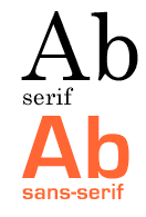
Second key point: Sans-serif rules the Web for a reason. Serif type is harder to read on a screen than sans-serif type. This applies to small sizes, like what you are reading right now. Big type (like the trashy-looking header at the top of this page) can be perfectly readable with serifs.
So you need to decide what you want for the body font (the regular paragraphs for reading), and specify that in CSS. Then, if you want any display type (headings or labels in fancy fonts), create those in Photoshop and save them as GIFs.
> See examples of Web typography use.
> Educate yourself about typography at Counterspace.
> Return to the syllabus schedule page.

