Exercise 4
FOCUS Color and link styles in CSS
PURPOSE Show your competency in selecting and specifying color in CSS. Demonstrate your ability to use CSS to create link effects.
VALUE 2 points (see Grading): 1 point for originality, 1 point for best practices in your CSS choices.
DETAILS You will find three HTML files and one CSS file in this folder. Download all four files (NOTE: The CSS file was updated on Jan. 26, 2011). Make changes in the CSS file to create an original and appealing color scheme, AND create a horizontal navigation device that has a graphical look and feel.
Requirements
- Do not change anything in the HTML files.
- Change ONLY the CSS file.
- You may use background images on the navigation ONLY. (If you use background images, be sure to remember to upload them with your other files.)
- Do not concern yourself with fonts other than within the navigation. This assignment concerns ONLY navigation and color.
- Follow all the instructions below.
- Upload ALL FOUR files to your Web site and send me the URL of the HTML page, via e-mail, by the deadline.
Design Example
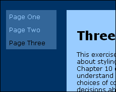
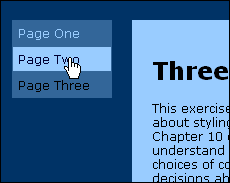
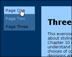
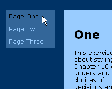
Many CSS gurus (including Cederholm) discuss ways to use an unordered list <ul> to create a navigation scheme with appealing hover effects. Here is a simple example:


Note that the color scheme for the design example is reasonably attractive, although not very original. Also, it is vertical. YOUR NAV MUST BE HORIZONTAL.
Do NOT copy this example. Come up with a good color scheme that you like, and try to create an original navigation panel, bar, tab set, whatever. This can be used in your Portfolio, if you're satisfied with it.
Instructions
- Your navigation must be horizontal. Place it above the main text box. Use CSS to style the nav div.
- Your navigation MUST show a visual hover effect.
- Your navigation MUST look and work the same in both IE 7/8 and Firefox 3. If you work on a Mac, you MUST test your work on a Windows computer in BOTH of these browsers.
- Pay attention to alignment. Failure to align elements precisely makes a design look sloppy.
- The visual relationship between your nav div and your main-box div should be aesthetically pleasing. (White space!)
- Your color scheme should demonstrate that you have read and understood the supplemental materials from Week 4.
- Change the background (color) of the body element, nav div and main-box div.
- Change color (that is the text color) as needed for legibility in both the nav div and the main-text div.
- Coordinate color and background for a:link, a:visited, a:active and a:hover with the rest of your color scheme. You will need to add these to the CSS.
In Chapters 2, 3 and 8, Cederholm covers all the CSS attributes you will need for this exercise. Chapter 2 will be ESPECIALLY helpful. It would be best for you to work through Chapter 2 step by step before starting this assignment.
Important Note
This exercise is a test drive for your Portfolio Web site. Try to come up with the final color scheme and navigation you will use in your portfolio. If you do, you will get my comments and feedback well in advance of your portfolio deadline. You'll have adequate time to improve your work, and your portfolio will be better as a result.